http://hyodev.dothome.co.kr/hotel/
Document
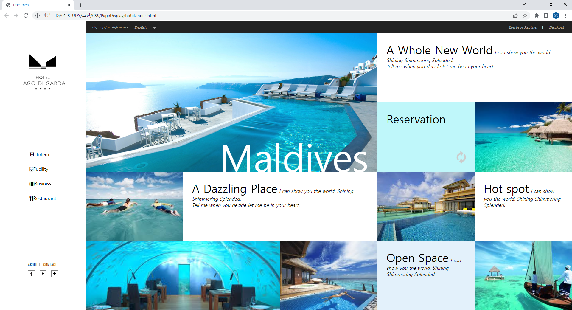
A Whole New World I can show you the world. Shining Shimmering Splended.Tell me when you decide let me be in your heart.
hyodev.dothome.co.kr
index.html
<!doctype html>
<html lang="ko">
 <head>
  <meta charset="UTF-8">
  <meta name="viewport" content="initial-scale=1, width=device-width"/>
  <title>Document</title>
  <link rel="stylesheet" href="https://cdnjs.cloudflare.com/ajax/libs/font-awesome/4.7.0/css/font-awesome.min.css">
  <link rel="stylesheet" href="css/reset.css">
  <link rel="stylesheet" href="css/style.css">
 </head>
 <body class="clearfix">
	<header>
		    <h1>logo</h1>
            <ul>
                <li><i class="fa fa-header"></i>Hotem</li>
                <li><i class="fa fa-building-o"></i>Fucility</li>
                <li><i class="fa fa-suitcase"></i>Businiss</li>
                <li><i class="fa fa-cutlery"></i>Restaurant</li>
            </ul>
            <div class="sns">
				<div>
					<a href="#"><img src="./img/sns1.png" alt=""></a>
					<a href="#"><img src="./img/sns2.png" alt=""></a>
				</div>
                <div>
					<a href="#"><img src="./img/sns3.png" alt=""></a>
					<a href="#"><img src="./img/sns4.png" alt=""></a>
					<a href="#"><img src="./img/sns5.png" alt=""></a>
				</div>

            </div>
	</header>
	<div class="content">
		<div class="quick">
            <div>
				<a href="#"><img src="./img/util1.png" alt=""></a>
                <a href="#"><img src="./img/util2.png" alt=""></a>
            </div>
            <div>
                <a href="#"><img src="./img/util3.png" alt=""></a>
                <a href="#"><img src="./img/util4.png" alt=""></a>
            </div>
		</div>
		<div class="main-content">
			<ul class="clearfix">
				 <!-- 내용1 -->
                    <li>
                        <div class="bg bg1"></div>
                        <span>Maldives</span>
                    </li>
                    <!-- 내용2 -->
                    <li>
                        <div class="txt">
                            <i class="fa fa-angle-right"></i>
                            <p>
                                <strong>A Whole New World</strong>
                                <em>I can show you the world. Shining Shimmering Splended.<br/>Tell me when you decide let me be in your heart.</em>
                            </p>
                        </div>
                    </li>
                    <!-- 내용3 -->
                    <li>
                        <div class="txt">
                            <i class="fa fa-spin fa-refresh"></i>
                            <p><strong>Reservation</strong></p>
                        </div>
                    </li>
                    <!-- 내용4 -->
                    <li>
                        <span>Suite</span>
                        <div class="bg bg2"></div>
                    </li>
                    <!-- 내용5 -->
                    <li>
                        <span>Surf</span>
                        <div class="bg bg3"></div>
                    </li>
                    <!-- 내용6 -->
                    <li>
                        <div class="txt">
                            <i class="fa fa-angle-right"></i>
                            <p>
                                <strong>A Dazzling Place</strong>
                                <em>I can show you the world. Shining Shimmering Splended.<br/>Tell me when you decide let me be in your heart.</em>
                            </p>
                        </div>
                    </li>
                    <!-- 내용7 -->
                    <li>
                        <span>Sauna</span>
                        <div class="bg bg4"></div>
                    </li>
                    <!-- 내용8 -->
                    <li>
                        <div class="txt">
                            <i class="fa fa-angle-right"></i>
                            <p>
                                <strong>Hot spot</strong>
                                <em>I can show you the world. Shining Shimmering Splended.</em>
                            </p>
                        </div>
                    </li>
                    <!-- 내용9 -->
                    <li>
                        <span>Diner</span>
                        <div class="bg bg5"></div>
                    </li>
                    <!-- 내용10 -->
                    <li>
                        <span>Spa</span>
                        <div class="bg bg6"></div>
                    </li>
                    <!-- 내용11 -->
                    <li>
                        <div class="txt">
                            <i class="fa fa-angle-right"></i>
                            <p>
                                <strong>Open Space</strong>
                                <em>I can show you the world. Shining Shimmering Splended.</em>
                            </p>
                        </div>
                    </li>
                    <!-- 내용12 -->
                    <li>
                        <span>Tour</span>
                        <div class="bg bg7"></div>
                    </li>
			</ul>
		</div>
	</div>
 </body>
</html>
style.scss
@mixin flexlayout ($dir: column, $wrap: nowrap, $justify: space-between, $align: center)
{
display: flex;
flex-flow: $dir $wrap;
justify-content: $justify;
align-items: $align;
}
.clearfix {
&::after {
content: "";
display: block;
clear: both;
}
}
body {
width: 100%;
max-width: 2000px;
margin: 0 auto;
}
header {
width: 15%;
height: 100vh;
float: left;
@include flexlayout();
h1 {
background: url('../img/logo1.png') center center/100% no-repeat;
width: 150px;
height: 300px;
font-size: 0;
margin-top: 50px;
}
ul {
padding-top: 100px;
li {
padding: 15px;
color: #2b2b2b;
font-weight: lighter;
font-size: 14px;
i {
padding-right: 10px;
}
}
}
.sns {
padding: 180px 0;
}
}
.content {
background: pink;
width: 85%;
height: 100vh;
float: right;
.quick {
@include flexlayout($dir: row);
background-color: #222;
padding: 10px;
height: 40px;
}
.main-content {
height: calc(100% - 40px);
ul{
height: 100%;
li {
float: left;
position: relative;
overflow: hidden;
.bg {
width: 100%;
height: 100%;
background-position: center center;
background-size: cover;
background-repeat: no-repeat;
transition: 0.5s;
}
&:not(:first-child) span {
position: absolute;
color: #fff;
top: 65%;
right: 5%;
font-size: 60px;
opacity: 0;
z-index: 1;
transition: 0.5s;
}
.txt {
p {
padding: 40px;
strong {
font-size: 36px;
font-weight: lighter;
}
em {
font-size: 12px;
color: #aaa;
}
}
}
&:nth-child(1) {
width: 60%;
// height: 500px;
height: 50%;
.bg1 {
background-image: url('../img/pic1.jpg');
}
span {
position: absolute;
color: #fff;
top: 70%;
left: 40%;
font-size: 140px;
transition: 0.5s;
}
&:hover .bg{
transform: scale(1.2);
}
&:hover span{
color: #222;
}
}
&:nth-child(2) {
width: 40%;
height: 25%;
background: #fff;
transition: 0.5s;
&:hover {
background: #87ceeb;
}
i {
font-size: 50px;
position: absolute;
left: 100%;
top: 60%;
color: #aaa;
transition: 0.5s;
}
&:hover i {
left: 90%;
}
}
&:nth-child(3) {
width: 20%;
height: 25%;
background: #bff7fa;
i {
position: absolute;
font-size: 45px;
top: 65%;
left: 75%;
color: #aaa;
}
}
&:nth-child(4) {
width: 20%;
height: 25%;
.bg2 {
background-image: url('../img/pic2.jpg');
}
&:hover .bg{
transform: scale(1.2);
}
&:hover span {
opacity: 1;
}
}
&:nth-child(5) {
width: 20%;
height: 25%;
.bg3 {
background-image: url('../img/pic3.jpg');
}
&:hover .bg{
transform: scale(1.2);
}
&:hover span {
opacity: 1;
}
}
&:nth-child(6) {
width: 40%;
height: 25%;
background: #fff;
&:hover {
background: #87ceeb;
}
i {
font-size: 50px;
position: absolute;
left: 100%;
top: 60%;
color: #aaa;
transition: 0.5s;
}
&:hover i {
left: 90%;
}
}
&:nth-child(7) {
width: 20%;
height: 25%;
.bg4 {
background-image: url('../img/pic4.jpg');
}
&:hover .bg{
transform: scale(1.2);
}
&:hover span {
opacity: 1;
}
}
&:nth-child(8) {
width: 20%;
height: 25%;
background: #fff;
&:hover {
background: #87ceeb;
}
i {
font-size: 50px;
position: absolute;
left: 100%;
top: 60%;
color: #aaa;
transition: 0.5s;
}
&:hover i {
left: 90%;
}
&:hover .bg{
transform: scale(1.2);
}
}
&:nth-child(9) {
width: 40%;
height: 25%;
.bg5 {
background-image: url('../img/pic5.jpg');
}
&:hover .bg{
transform: scale(1.2);
}
&:hover span {
opacity: 1;
}
}
&:nth-child(10) {
width: 20%;
height: 25%;
.bg6 {
background-image: url('../img/pic6.jpg');
}
&:hover .bg{
transform: scale(1.2);
}
&:hover span {
opacity: 1;
}
}
&:nth-child(11) {
width: 20%;
height: 25%;
background: #e3f1fb;
&:hover {
background: #87ceeb;
}
i {
font-size: 50px;
position: absolute;
left: 100%;
top: 60%;
color: #aaa;
transition: 0.5s;
}
&:hover i {
left: 90%;
}
}
&:nth-child(12) {
width: 20%;
height: 25%;
.bg7 {
background-image: url('../img/pic7.jpg');
}
&:hover .bg{
transform: scale(1.2);
}
&:hover span {
opacity: 1;
}
}
}
}
}
}
// @media screen and (max-width: 1024px) {
// }
style_teacher.scss (+ 반응형)
$libgColor: #bff7fa;
$libhColor2: #e3f1fb;
$lihoverColor: #87ceeb;
@mixin flexlayout($dir: row, $wrap: nowrap, $just: space-between, $align: center) {
display: flex;
flex-flow: $dir $wrap;
justify-content: $just;
align-items: $align;
}
.clearfix {
&::after {
content: "";
display: block;
clear: both;
}
}
body {
@include flexlayout();
header {
@include flexlayout($dir: column);
width: 15%;
height: 100vh; // vh: 브라우저의 높이, vw: 브라우저의 너비
padding: 110px 0;
h1 {
background: url('../img/logo1.png') center center/ contain no-repeat;
font-size: 0;
width: 80%;
height: 120px;
}
li {
padding: 14px;
}
}
.content {
width: 85%;
height: 100vh;
.quick {
background: #222;
color: #fff;
height: 40px;
@include flexlayout();
padding: 0 16px;
}
.main-content {
height: calc(100% - 40px);
ul {
height: 100%;
li {
float: left;
position: relative;
overflow: hidden;
.bg {
background-repeat: no-repeat;
background-position: center center;
background-size: cover;
height: 100%;
width: 100%;
transition: 0.5s;
}
.bg1 {
background-image: url(../img/pic1.jpg);
}
.bg2 {
background-image: url(../img/pic2.jpg);
}
.bg3 {
background-image: url(../img/pic3.jpg);
}
.bg4 {
background-image: url(../img/pic4.jpg);
}
.bg5 {
background-image: url(../img/pic5.jpg);
}
.bg6 {
background-image: url(../img/pic6.jpg);
}
.bg7 {
background-image: url(../img/pic7.jpg);
}
span {
position: absolute;
bottom: 30px;
right: 30px;
color: #fff;
font-size: 34px;
z-index: 10;
opacity: 0;
transition: 0.5s;
}
.txt {
height: 100%;
padding: 30px;
transition: 0.5s;
i {
position: absolute;
bottom: 30px;
right: -100px;
font-size: 36px;
color: #ccc;
transition: 0.5s;
}
strong {
font-size: 38px;
font-weight: normal;
}
}
&:nth-child(1) {
width: 60%;
height: 50%;
span {
font-size: 126px;
bottom: -10px;
line-height: 1;
opacity: 1;
}
&:hover span{
color: #222;
}
}
&:nth-child(2) {
width: 40%;
height: 25%;
}
&:nth-child(3) {
width: 20%;
height: 25%;
background: $libgColor;
i {
right: 30px;
}
}
&:nth-child(4) {
width: 20%;
height: 25%;
}
&:nth-child(5) {
width: 20%;
height: 25%;
}
&:nth-child(6) {
width: 40%;
height: 25%;
}
&:nth-child(7) {
width: 20%;
height: 25%;
}
&:nth-child(8) {
width: 20%;
height: 25%;
}
&:nth-child(9) {
width: 40%;
height: 25%;
}
&:nth-child(10) {
width: 20%;
height: 25%;
}
&:nth-child(11) {
width: 20%;
height: 25%;
background: $libhColor2;
}
&:nth-child(12) {
width: 20%;
height: 25%;
}
&:hover {
.bg {
transform: scale(1.2);
}
span {
opacity: 1;
}
.txt:not(.bgtxt) {
background: $lihoverColor;
i {
right: 30px
}
}
}
}
}
}
}
}
@media screen and (max-width: 1582px) {
body {
flex-direction: column;
header {
width: 100%;
flex-direction: row;
justify-content: flex-end;
padding: 0 20px;
height: 80px;
h1 {
background-image: url(../img/logo2.png);
width: 18%;
min-width: 200px;
position: absolute;
left: 30px;
}
> ul {
@include flexlayout();
}
.sns {
@include flexlayout();
div:nth-child(1) {
padding-top: 10px;
padding-right: 20px;
}
}
}
.content { width: 100%; }
}
}
@media screen and (max-width: 1260px) {
body {
header {
.sns {
display: none;
}
}
.content {
.main-content {
ul li {
&:nth-child(1) { width: 75%; }
&:nth-child(2) { width: 25%; }
&:nth-child(3) { width: 25%; }
&:nth-child(4) { width: 25%; }
&:nth-child(5) { width: 25%; }
&:nth-child(6) { width: 50%; }
&:nth-child(7) { width: 50%; }
&:nth-child(8) { width: 25%; }
&:nth-child(9) { width: 25%; }
&:nth-child(10) { width: 50%; }
&:nth-child(11) { width: 25%; }
&:nth-child(12) { width: 25%; }
}
}
}
}
}
@media screen and (max-width: 1006px) {
body {
header {
.sns {
display: none;
}
}
.content {
.main-content {
ul li {
&:nth-child(1) { width: 100%; }
&:nth-child(2) { width: 66.6666%; }
&:nth-child(3) { width: 33.3333%; }
&:nth-child(4) { width: 33.3333%; display: none; }
&:nth-child(5) { width: 33.3333%; }
&:nth-child(6) { width: 66.6666%; }
&:nth-child(7) { width: 50%; display: none;}
&:nth-child(8) { width: 33.3333%; }
&:nth-child(9) { width: 33.3333%; }
&:nth-child(10) { width: 33.3333%; display: none; }
&:nth-child(11) { width: 33.3333%; }
&:nth-child(12) { width: 25%; display: none;}
}
}
}
}
}
@media screen and (max-width: 762px) {
body {
.content {
.main-content {
ul li {
&:nth-child(1) { width: 100%; }
&:nth-child(2) { width: 100%; }
&:nth-child(3) { width: 33.3333%; display: none; }
&:nth-child(4) { width: 33.3333%; display: none; }
&:nth-child(5) { width: 50%; }
&:nth-child(6) { width: 50%; }
&:nth-child(7) { width: 50%; display: none;}
&:nth-child(8) { width: 50%; }
&:nth-child(9) { width: 50%; }
&:nth-child(10) { width: 50%; display: none; }
&:nth-child(11) { width: 50%; }
&:nth-child(12) { width:50%; display: block; }
}
}
}
}
}
@media screen and (max-width: 622px) {
body {
header {
flex-direction: column;
height: 150px;
h1 {
left: 50%;
transform: translate(-50%, 0);
top: 20px;
height: 80px;;
}
ul {
width: 100%;;
li {
width: 25%;
text-align: center;
}
}
.sns {
display: none;
}
}
.content {
.quick {
display: none;
}
.main-content {
ul li {
&:nth-child(1) { width: 100%; }
&:nth-child(2) { width: 100%; }
&:nth-child(3) { width: 33.3333%; display: none; }
&:nth-child(4) { width: 33.3333%; display: none; }
&:nth-child(5) { width: 50%; }
&:nth-child(6) { width: 50%; }
&:nth-child(7) { width: 50%; display: none;}
&:nth-child(8) { width: 50%; }
&:nth-child(9) { width: 50%; }
&:nth-child(10) { width: 50%; display: none; }
&:nth-child(11) { width: 50%; }
&:nth-child(12) { width:50%; display: block; }
}
}
}
}
}
@media screen and (max-width: 476px) {
body {
header {
height: 100vh;
background: url(../img/pic1.jpg) center center/ cover no-repeat ;
justify-content: center;
align-items: center;
h1 {
position: static;
transform: translate(0, 0);
}
ul {
flex-direction: column;
padding-top: 80px;
li {
background: rgba(0, 0, 0, 0.4);
color: #fff;
border-radius: 4px;
margin-bottom: 10px;
width: 80%;
}
}
}
.content {
display: none;
}
}
}'Stack > CSS' 카테고리의 다른 글
| [CSS / SCSS] SCSS로 Style 적용하기 5 (현대삼호중공업) (0) | 2022.04.22 |
|---|---|
| [CSS] CSS 애니메이션 (0) | 2022.04.20 |
| [CSS / SCSS] SCSS로 Style 적용하기 3 (Samsung) (0) | 2022.04.19 |
| [CSS / SCSS] SCSS로 Style 지정하기 2 (Display) (0) | 2022.04.19 |
| [CSS / SCSS] SCSS로 Style 지정하기 (Isaknox) (0) | 2022.04.19 |