[CSS] hover / position / overflow / transition / transform 연습
:hover
요소에 마우스를 올렸을 때 스타일을 지정
내 안에 있는 애들한테만 스타일 적용 가능
1) 선택한 요소
2) 선택한 요소의 하위요소
menuhover.html
<!DOCTYPE html>
<html lang="en">
<head>
    <meta charset="UTF-8">
    <meta http-equiv="X-UA-Compatible" content="IE=edge">
    <meta name="viewport" content="width=device-width, initial-scale=1.0">
    <title>Document</title>
    <style>
        * { margin: 0; padding: 0; box-sizing: border-box; }
        a { text-decoration: none; color: inherit; } /* color: inherit 적어줘야 hover 적용 가능 */
        body { color: #222; }
        #header {
            width: 1200px;
            margin: 0 auto;
        }
        h1 { float: left; }
        ul { float: right; }
        li { float: left; padding: 0 20px; list-style: none; }
        li:hover {
            color: red;
        }
        li div {
            display: none; /* 서브메뉴영역 안보임 */
        }
        li:hover div { /* li 안에 하위 div 마우스 올리면 보이게 해줘 */
            display: block;
        }
    </style>
</head>
<body>
    <div id="header">
        <h1>green</h1>
        <ul>
            <!-- (li>a{menu$})*4 -->
            <li>
                <a href="#">menu1</a>
                <div>서브메뉴영역</div>
            </li>
            <li>
                <a href="#">menu2</a>
                <div>서브메뉴영역</div>
            </li>
            <li>
                <a href="#">menu3</a>
                <div>서브메뉴영역</div>
            </li>
            <li>
                <a href="#">menu4</a>
                <div>서브메뉴영역</div>
            </li>
        </ul>
    </div>
</body>
</html>
menuhover_me.html
<!DOCTYPE html>
<html lang="en">
<head>
    <meta charset="UTF-8">
    <meta http-equiv="X-UA-Compatible" content="IE=edge">
    <meta name="viewport" content="width=device-width, initial-scale=1.0">
    <title>Document</title>
    <style>
        /* 셋팅 */
        * { margin: 0; padding: 0; box-sizing: border-box; }
        a { text-decoration: none; color: inherit; }
        li { list-style: none; }
        body { color: #222; font-size: 20px; }
        /* 셋팅 /*/

        #header {
            width: 1200px;
            margin: 0 auto;
            text-align: center;
        }
        #header h1 {
            padding-top: 70px;
            padding-bottom: 30px;
            border-bottom: 3px solid #222;
        }
        ul {
            padding-top: 20px;
            padding-bottom: 45px;
            border-bottom: 1px solid #222;
        }
        li {
            float: left;
            width: 16.666%;
        }
        .clearBoth::after {
            content: "";
            display: block;
            clear: both;
        }
        li > a:hover {
            color: red;
        }
        li div {
            display: none;
            font-size: 16px;
            padding-top: 2px;
        }
        li:hover div {
            display: block;
        }
        .sub {
            padding-top: 30px;
        }
    </style>
</head>
<body>
    <div id="header" class="clearBoth">
        <h1>GreenMall</h1>
        <ul>
            <li>
                <a href="#">제품소개</a>
                <div class="sub">
                    <div><a href="#">submenu1</a></div>
                    <div><a href="#">submenu2</a></div>
                    <div><a href="#">submenu3</a></div>
                </div>
            </li>
            <li>
                <a href="#">구매안내</a>
                <div class="sub">
                    <div><a href="#">submenu1</a></div>
                    <div><a href="#">submenu2</a></div>
                    <div><a href="#">submenu3</a></div>
                </div>
            </li>
            <li>
                <a href="#">고객센터</a>
                <div class="sub">
                    <div><a href="#">submenu1</a></div>
                    <div><a href="#">submenu2</a></div>
                    <div><a href="#">submenu3</a></div>
                </div>
            </li>
            <li>
                <a href="#">서비스</a>
                <div class="sub">
                    <div><a href="#">submenu1</a></div>
                    <div><a href="#">submenu2</a></div>
                    <div><a href="#">submenu3</a></div>
                </div>
            </li>
            <li>
                <a href="#">홍보센터</a>
                <div class="sub">
                    <div><a href="#">submenu1</a></div>
                    <div><a href="#">submenu2</a></div>
                    <div><a href="#">submenu3</a></div>
                </div>
            </li>
            <li>
                <a href="#">기업소개</a>
                <div class="sub">
                    <div><a href="#">submenu1</a></div>
                    <div><a href="#">submenu2</a></div>
                    <div><a href="#">submenu3</a></div>
                </div>
            </li>
        </ul>
    </div>
</body>
</html>
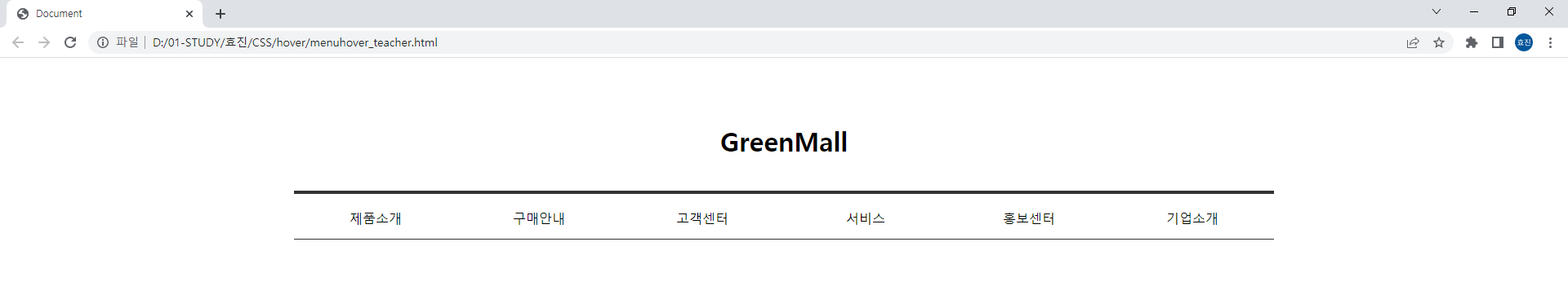
menuhover_teacher.html
<!DOCTYPE html>
<html lang="en">
<head>
    <meta charset="UTF-8">
    <meta http-equiv="X-UA-Compatible" content="IE=edge">
    <meta name="viewport" content="width=device-width, initial-scale=1.0">
    <title>Document</title>
    <style>
        * { margin: 0; padding: 0; box-sizing: border-box; }
        li { list-style: none; }
        a { text-decoration: none; color: inherit; }
        #header {
            width: 1200px;
            margin: 0 auto;
            text-align: center;
        }
        h1 {
            padding-top: 80px;
            padding-bottom: 40px;
        }
        #header > ul {
            height: 60px;
            border-top: 4px solid #333;
            border-bottom: 1px solid #333;
        }
        #header > ul > li {
            float:left;
            width: 16.6666%;
            line-height: 60px;
        }
        li li {
            line-height: 1.6;
        }
        li ul {
            display: none;
        }
        li:hover ul {
            display: block;
        }
        #header > ul > li:hover > a {
            color: tomato;
        }
        li li:hover {
            color: blue;
        }
    </style>
</head>
<body>
    <div id="header">
        <h1>GreenMall</h1>
        <ul>
            <li>
                <a href="#">제품소개</a>
                <ul>
                    <li><a href="#">submenu1</a></li>
                    <li><a href="#">submenu2</a></li>
                    <li><a href="#">submenu3</a></li>
                </ul>
            </li>
            <li>
                <a href="#">구매안내</a>
                <ul>
                    <li><a href="#">submenu1</a></li>
                    <li><a href="#">submenu2</a></li>
                    <li><a href="#">submenu3</a></li>
                </ul>
            </li>
            <li>
                <a href="#">고객센터</a>
                <ul>
                    <li><a href="#">submenu1</a></li>
                    <li><a href="#">submenu2</a></li>
                    <li><a href="#">submenu3</a></li>
                </ul>
            </li>
            <li>
                <a href="#">서비스</a>
                <ul>
                    <li><a href="#">submenu1</a></li>
                    <li><a href="#">submenu2</a></li>
                    <li><a href="#">submenu3</a></li>
                </ul>
            </li>
            <li>
                <a href="#">홍보센터</a>
                <ul>
                    <li><a href="#">submenu1</a></li>
                    <li><a href="#">submenu2</a></li>
                    <li><a href="#">submenu3</a></li>
                </ul>
            </li>
            <li>
                <a href="#">기업소개</a>
                <ul>
                    <li><a href="#">submenu1</a></li>
                    <li><a href="#">submenu2</a></li>
                    <li><a href="#">submenu3</a></li>
                </ul>
            </li>
        </ul>
    </div>
</body>
</html>
position
html 문서 상에서 요소가 배치되는 방식을 결정
static: html 문서 상에서 원래 있어야 하는 위치에 배치하는 방식 (default)
relative: 원래 위치를 기준으로 상대적으로 배치하는 방식
absoulute: 원래 위치 기준이 아닌 브라우저를 기준으로 배치하는 방식
fixed: 스크롤시 고정된 위치에 배치하는 방식
sticky
top: 상단에서 요소의 위치를 지정
left: 왼쪽에서 요소의 위치를 지정
right: 오른쪽에서 요소의 위치를 지정
bottom: 아래쪽에서 요소의 위치를 지정
z-index
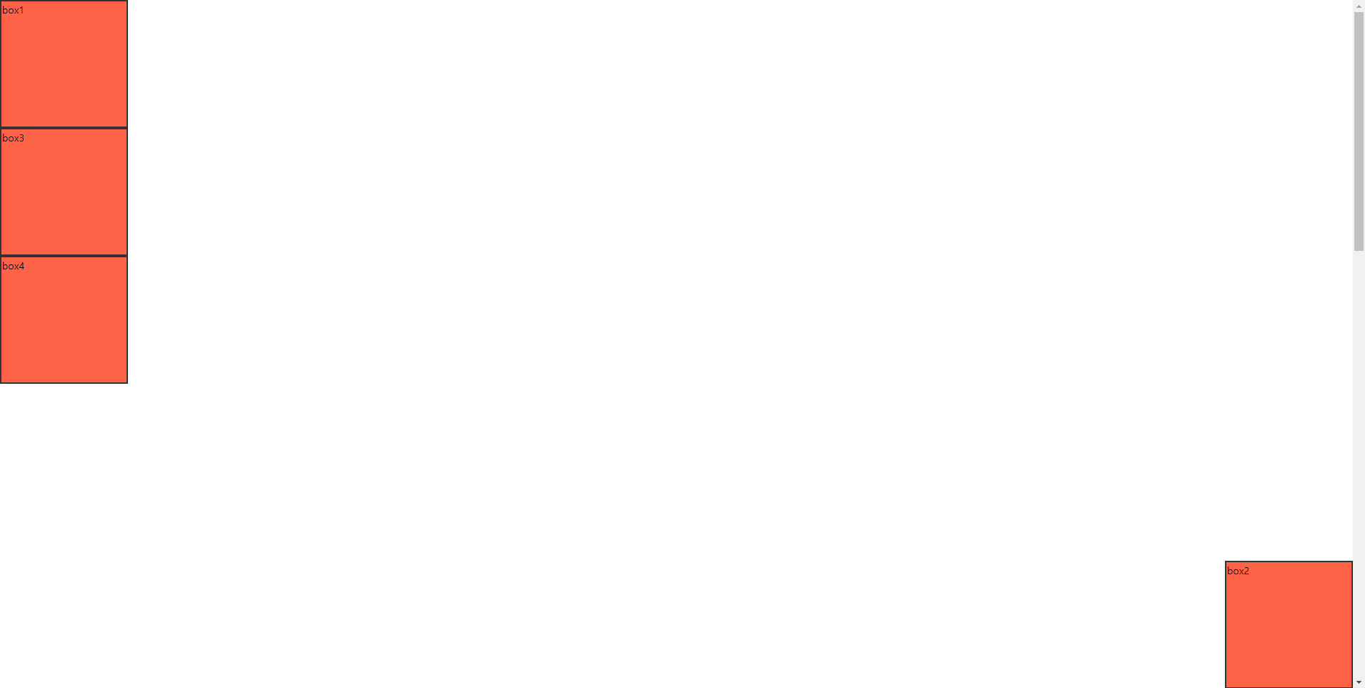
position.html
<!DOCTYPE html>
<html lang="en">
<head>
    <meta charset="UTF-8">
    <meta http-equiv="X-UA-Compatible" content="IE=edge">
    <meta name="viewport" content="width=device-width, initial-scale=1.0">
    <title>Document</title>
    <style>
        * { margin: 0; padding: 0; box-sizing: border-box; }
        body { height: 3000px; }
        div {
            width: 200px;
            height: 200px;
            background: tomato;
            border: 3px solid #333;
        }
        div:nth-child(2) {
            position: absolute;
            bottom: 0;
            right: 0;
        }
    </style>
</head>
<body>
    <div>box1</div>
    <div>box2</div>
    <div>box3</div>
    <div>box4</div>
</body>
</html>
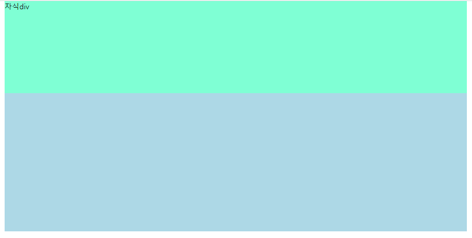
position_02.html
<!DOCTYPE html>
<html lang="en">
<head>
    <meta charset="UTF-8">
    <meta http-equiv="X-UA-Compatible" content="IE=edge">
    <meta name="viewport" content="width=device-width, initial-scale=1.0">
    <title>Document</title>
    <style>
        * { margin: 0; padding: 0; box-sizing: border-box; }
        #parent {
            width: 1000px;
            background-color: lightblue;
            margin: 0 auto;
            height: 500px;
            position: relative;
        }
        #children {
            width: 100%;
            height: 200px;
            background-color: aquamarine;
            position: absolute; /* absolute는 부모 width 무시 */
            top: 0;
            left: 0;
        }

    </style>
</head>
<body>
    <div id="parent">
        부모div
        <div id="children">자식div</div>
    </div>
</body>
</html>
position02_02.html

<!DOCTYPE html>
<html lang="en">
<head>
    <meta charset="UTF-8">
    <meta http-equiv="X-UA-Compatible" content="IE=edge">
    <meta name="viewport" content="width=device-width, initial-scale=1.0">
    <title>Document</title>
    <style>
        * { margin: 0; padding: 0; box-sizing: border-box; }
        ul {
            width: 1000px;
            margin: 0 auto;
            padding: 40px;
        }
        li {
            float: left;
            width: 25%;
            text-align: center;
            list-style: none;
            background-color: lightblue;
            line-height: 60px;
            position: relative;
        }
        a { text-decoration: none; color:inherit; }
        li::after {
            content: "";
            display: block;
            width: 3px;
            height: 40px;
            background-color: tomato;
            position: absolute;
            right: 0;
            top: 10px;
        }
    </style>
</head>
<body>
    <ul>
        <li><a href="#">menu1</a></li>
        <li><a href="#">menu2</a></li>
        <li><a href="#">menu3</a></li>
        <li><a href="#">menu4</a></li>
    </ul>
</body>
</html>
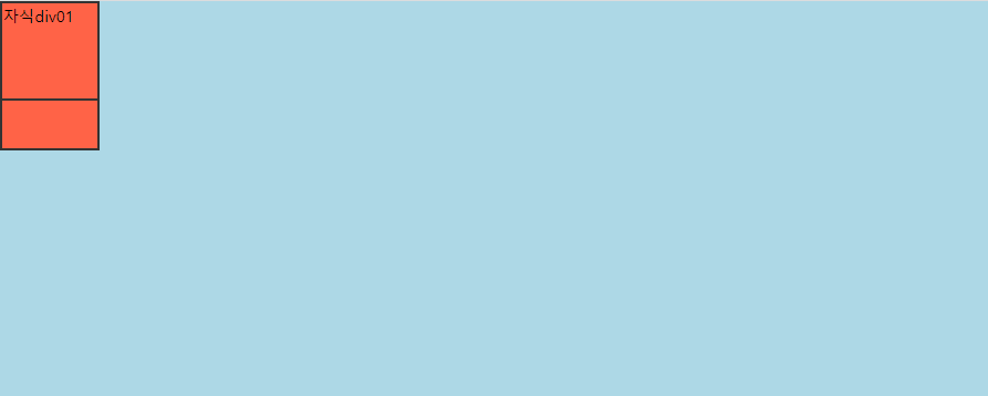
position_03.html
<!DOCTYPE html>
<html lang="en">
<head>
    <meta charset="UTF-8">
    <meta http-equiv="X-UA-Compatible" content="IE=edge">
    <meta name="viewport" content="width=device-width, initial-scale=1.0">
    <title>Document</title>
    <style>
        * { margin: 0; padding: 0; box-sizing: border-box; }
        #parent {
            width: 1000px;
            height: 400px;
            background-color: lightblue;
            position: relative;
        }
        .children {
            width: 100px;
            height: 100px;
            background-color: tomato;
            border: 3px solid #333;
        }
        .children:nth-child(1) {
            z-index: 10;
            position: relative; /* z-index 쓸라면 포지션도 같이 ! */
        }
        .children:nth-child(2) {
            z-index: 5;
            position: absolute;
            top: 50px;
        }
    </style>
</head>
<body>
    <div id="parent">
        <div class="children">자식div01</div>
        <div class="children">자식div02</div>
    </div>
</body>
</html>
position_sticky.html
<!DOCTYPE html>
<html lang="en">
<head>
    <meta charset="UTF-8">
    <meta http-equiv="X-UA-Compatible" content="IE=edge">
    <meta name="viewport" content="width=device-width, initial-scale=1.0">
    <title>Document</title>
    <style>
        * { margin: 0; padding: 0; box-sizing: border-box; }
        #parent1 {
            width: 1200px;
            margin: 0 auto;
            height: 1300px;
            background-color: yellow;
            /* position: relative; */
        }
        #parent2 {
            width: 1200px;
            margin: 0 auto;
            height: 1300px;
            background-color: blue;
        }
        #children {
            width: 200px;
            height: 200px;
            position: sticky;
            left: 300px;
            top: 200px;
            background-color: tomato;
        }
    </style>
</head>
<body>
    <div id="parent1">
        첫번째 div
        <div id="children">자식div </div>
    </div>
    <div id="parent2">
        두번째 div
    </div>
</body>
</html>
overflow: hidden
나보다 큰 애 숨김
overflow: scroll
나보다 크면 스크롤 만들어줌
<!DOCTYPE html>
<html lang="en">
<head>
    <meta charset="UTF-8">
    <meta http-equiv="X-UA-Compatible" content="IE=edge">
    <meta name="viewport" content="width=device-width, initial-scale=1.0">
    <title>Document</title>
    <style>
        body > div {
            width: 200px;
            height: 200px;
            background: lightblue;
            /* overflow: scroll; */
            overflow: hidden;
        }
        div div {
            background: blue;
            width: 400px;
            height: 400px;
        }
    </style>
</head>
<body>
    <div>
        <img src="./images/1.jpg" alt="">
        <div>월요일좋아~월요일좋아~월요일좋아~월요일좋아~<br>월요일좋아~월요일좋아~월요일좋아~월요일좋아~</div>
    </div>
</body>
</html>
transition
transition-property: 트렌지션을 적용해야하는 css 속성명을 지정
transition-duration: 트렌지션이 일어나는 지속 시간을 지정 (동작시간)
transition-timing-function: 트렌지션이 일어나는 시간함수를 지정
transform (transition이랑 같이 씀)
transform: translate(x, y)
transform: scale(x, y)
transform: rotate(45deg)
transform: skewX(45deg)
transform: skewY(45deg)
move.html
<!DOCTYPE html>
<html lang="en">
<head>
    <meta charset="UTF-8">
    <meta http-equiv="X-UA-Compatible" content="IE=edge">
    <meta name="viewport" content="width=device-width, initial-scale=1.0">
    <title>Document</title>
    <style>
        div {
            position: relative;
            width: 100px;
            height: 100px;
            background-color: tomato;
            left: 50px;
            /* transition-property: left; 생략 가능
            transition-duration: 0.5s; */
            transition: 0.5s; /* 속기법 */
        }
        div:hover {
            /* left: 100px; */
            width: 200px;
        }
    </style>
</head>
<body>
    <div>box</div>
</body>
</html>
<!DOCTYPE html>
<html lang="en">
<head>
    <meta charset="UTF-8">
    <meta http-equiv="X-UA-Compatible" content="IE=edge">
    <meta name="viewport" content="width=device-width, initial-scale=1.0">
    <title>Document</title>
    <style>
        div {
            width: 100px;
            height: 100px;
            background-color: tomato;
            transition: 0.5s;
        }
        div:hover {
            transform: skewX(45deg);
        }
    </style>
</head>
<body>
    <div></div>
</body>
</html>
transform_ex.html
<!DOCTYPE html>
<html lang="en">
<head>
    <meta charset="UTF-8">
    <meta http-equiv="X-UA-Compatible" content="IE=edge">
    <meta name="viewport" content="width=device-width, initial-scale=1.0">
    <title>Document</title>
    <style>
        * { margin: 0; padding: 0; box-sizing: border-box; }
        body > div {
            width: 200px;
            height: 200px;
            background: #ccc;
            float: left;
            margin: 40px;
            padding: 50px;
        }
        div div {
            background: tomato;
            width: 100px;
            height: 100px;
            transition: 0.5s;
        }
        body > div:nth-child(1):hover div {
            transform: translate(100px, 0);
        }
        body > div:nth-child(2):hover div {
            transform: translate(0, 100px);
        }
        body > div:nth-child(3):hover div {
            transform: scale(2,1);
        }
        body > div:nth-child(4):hover div {
            transform: scale(1,2);
        }
        body > div:nth-child(5):hover div {
            transform: skewX(45deg);
        }
        body > div:nth-child(6):hover div {
            transform: skewY(45deg);
        }
        body > div:nth-child(7):hover div {
            transform: rotate(45deg);
        }
        body > div:nth-child(8):hover div {
            transform: scale(2, 2);
        }
    </style>
</head>
<body>
    <div>
        <div></div>
    </div>
    <div>
        <div></div>
    </div>
    <div>
        <div></div>
    </div>
    <div>
        <div></div>
    </div>
    <div>
        <div></div>
    </div>
    <div>
        <div></div>
    </div>
    <div>
        <div></div>
    </div>
    <div>
        <div></div>
    </div>
</body>
</html>
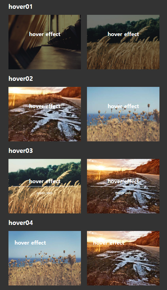
image_hover.html (98% 완성)
<!DOCTYPE html>
<html lang="en">
<head>
    <meta charset="UTF-8">
    <meta http-equiv="X-UA-Compatible" content="IE=edge">
    <meta name="viewport" content="width=device-width, initial-scale=1.0">
    <title>Document</title>
    <style>
        * { margin: 0; padding: 0; box-sizing: border-box; }
        body {
            background: #333;
            color: #fff;
        }
        img {
            vertical-align: top; /* 필수!! 이미지 밑에 약간 뭐 그런거 안뜨게 함 */
        }
        #wrap {
            width: 1000px;
            margin: 0 auto;
        }
        h2 {
            padding: 30px 0;
        }
        li { list-style: none; float: left; width: 48%; position: relative; }
        li img {
            width: 100%;
        }
        li:nth-child(1) {
            margin-right: 4%;
        }
        .bg {
            position: absolute;
            width: 100%;
            height: 100%;
            background: rgba(0, 0, 0, 0.5);
            left: 0;
            top: 0;
        }
        .text {
            position: absolute;
            top: 100px;
            text-align: center;
            width: 100%;
            transition: 0.5s;
        }
        #hover1 .text p {
            opacity: 0;
            transition: 0.5s;
        }
        #hover1 li:hover p {
            opacity: 1;
        }
        #hover1 li:hover .text {
            top: 160px;
        }
        /* before이랑 after을 이용하여 편하게 */
        #hover1 li::after {
            content: "";
            display: block;
            position: absolute;
            left: 30px;
            top: 30px;
            right: 30px;
            bottom: 30px;
            border-top: 1px solid #fff;
            border-bottom: 1px solid #fff;
            transform: scale(0, 1); /* 너비는 없고 높이만 있는 상태, 그래서 눈에 안보임 */
            transition: 0.5s;
        }
        #hover1 li:hover::after {
            transform: scale(1, 1); /* 1=100% 이케하면 보임 */
        }
        #hover1 li::before {
            content: "";
            display: block;
            position: absolute;
            left: 30px;
            top: 30px;
            right: 30px;
            bottom: 30px;
            border-left: 1px solid #fff;
            border-right: 1px solid #fff;
            transform: scale(1, 0);
            transition: 0.5s;
        }
        #hover1 li:hover::before {
            transform: scale(1, 1);
        }
        #hover2 {
            padding-top: 400px;
        }
        #hover2 li .bg2 {
            transition: 0.5s;
        }
        #hover2 li:hover .bg2 {
            position: absolute;
            width: 100%;
            height: 100%;
            background: rgba(0, 0, 0, 0.5);
            left: 0;
            top: 0;
        }
        #hover2 li {
            overflow: hidden;
        }
        #hover2 li::after {
            content: "";
            display: block;
            position: absolute;
            left: 30px;
            top: 30px;
            right: 30px;
            bottom: 30px;
            border: 1px solid #fff;
            transform: scale(1.3, 1.3);
            transition: 0.7s;
        }
        #hover2 li:hover::after {
            transform: scale(1, 1);
        }
        #hover2 img {
            transform: scale(1.3, 1.3);
            transition: 0.7s;
        }
        #hover2 li:hover img{
            transform: scale(1, 1);
        }
        #hover3 {
            padding-top: 400px;
        }
        #hover3 li .bg2 {
            transition: 0.5s;
        }
        #hover3 li:hover .bg2 {
            position: absolute;
            width: 100%;
            height: 100%;
            background: rgba(0, 0, 0, 0.5);
            left: 0;
            top: 0;
        }
        #hover3 li::after {
            content: "";
            display: block;
            position: absolute;
            left: 30px;
            top: 180px;
            right: 30px;
            border-top: 1px solid #fff;
            transform: scale(1, 1);
            transition: 0.5s;
        }
        #hover3 li:hover::after {
            transform: rotate(45deg);
        }
        #hover3 .line {
            content: "";
            display: block;
            position: absolute;
            left: 30px;
            top: 180px;
            right: 30px;
            border-top: 1px solid #fff;
            transform: scale(1, 1);
            transition: 0.5s;
        }
        #hover3 li:hover .line{
            transform: rotate(-45deg);
        }
        .h3 {
            transition: 0.5s;
        }
        #hover3 li:hover .h3 {
            padding-top: 40px;
        }
        #hover3 p {
            transition: 0.5s;
            padding-top: 120px;
        }
        #hover3 li:hover p {
            padding-top: 25px;
        }
        #hover4 {
            padding-top: 400px;
            padding-bottom: 400px;
        }
        #hover4 li .bg2 {
            transition: 0.5s;
        }
        #hover4 li:hover .bg2 {
            position: absolute;
            width: 100%;
            height: 100%;
            background: rgba(0, 0, 0, 0.5);
            left: 0;
            top: 0;
        }
        .text2 {
            position: absolute;
            top: 150px;
            text-align: left;
            width: 100%;
            padding-left: 20px;
        }
        #hover4 li {
            overflow: hidden;
        }
        #hover4 p {
            transition: 0.8s;
            padding-top: 25px;
            padding-left: 500px;
            width: 120%;
        }
        #hover4 li:hover p {
            padding: 25px 0;
            display: block;
        }
        #hover4 .line {
            content: "";
            display: block;
            position: absolute;
            left: 20px;
            top: 180px;
            right: 30px;
            border-top: 1px solid #fff;
            transform: scale(1, 1);
            transition: 0.5s;
        }
        #hover4 li:hover .line{

        }
    </style>
</head>
<body>
    <div id="wrap">
        <div id="hover1">
            <h2>hover01</h2>
            <ul>
                <li>
                    <img src="./images/1.jpg" alt="">
                    <div class="bg"></div>
                    <div class="text">
                        <h3>hover effect</h3>
                        <p>green web</p>
                    </div>
                </li>
                <li>
                    <img src="./images/2.jpg" alt="">
                    <div class="bg"></div>
                    <div class="text">
                        <h3>hover effect</h3>
                        <p>green web</p>
                    </div>
                </li>
            </ul>
        </div>
        <div id="hover2">
            <h2>hover02</h2>
            <ul>
                <li>
                    <img src="./images/3.jpg" alt="">
                    <div class="bg2"></div>
                    <div class="text">
                        <h3>hover effect</h3>
                    </div>
                </li>
                <li>
                    <img src="./images/4.jpg" alt="">
                    <div class="bg2"></div>
                    <div class="text">
                        <h3>hover effect</h3>
                    </div>
                </li>
            </ul>
        </div>
        <div id="hover3">
            <h2>hover03</h2>
            <ul>
                <li>
                    <img src="./images/2.jpg" alt="">
                    <div class="bg2"></div>
                    <div class="text">
                        <div class="h3"><h3>hover effect</h3></div>
                        <p>green web</p>
                    </div>
                    <div class="line"></div>
                </li>
                <li>
                    <img src="./images/3.jpg" alt="">
                    <div class="bg2"></div>
                    <div class="text">
                        <div class="h3"><h3>hover effect</h3></div>
                        <p>green web</p>
                    </div>
                    <div class="line"></div>
                </li>
            </ul>
        </div>
        <div id="hover4">
            <h2>hover04</h2>
            <ul>
                <li>
                    <img src="./images/4.jpg" alt="">
                    <div class="bg2"></div>
                    <div class="text2">
                        <h3>hover effect</h3>
                        <p>green web</p>
                    </div>
                    <div class="line"></div>
                </li>
                <li>
                    <img src="./images/3.jpg" alt="">
                    <div class="bg2"></div>
                    <div class="text2">
                        <h3>hover effect</h3>
                        <p>green web</p>
                    </div>
                    <div class="line"></div>
                </li>
            </ul>
        </div>
        <div id="footer">
        </div>
    </div>
</body>
</html>
float 쓰면 clearboth 쓰는거 까먹지말라구 ~~~
image_hover_teacher.html
<!DOCTYPE html>
<html lang="en">
<head>
    <meta charset="UTF-8">
    <meta http-equiv="X-UA-Compatible" content="IE=edge">
    <meta name="viewport" content="width=device-width, initial-scale=1.0">
    <title>Document</title>
    <style>
        * { margin: 0; padding: 0; box-sizing: border-box; }
        body {
            background: #333;
            color: #fff;
        }
        img {
            vertical-align: top; /* 필수!! 이미지 밑에 약간 뭐 그런거 안뜨게 함 */
        }
        #wrap {
            width: 1000px;
            margin: 0 auto;
        }
        h2 {
            padding: 30px 0;
            font-size: 42px;
        }
        li { list-style: none; float: left; width: 48%; position: relative; overflow: hidden; }
        /* li float 줘서 ul에게 clearboth 줌 */
        .clearboth::after {
            content: "";
            display: block;
            clear: both;
        }
        li img {
            width: 100%;
        }
        li:nth-child(1) {
            margin-right: 4%;
        }
        p {
            font-size: 22px;
        }
        h3 {
            font-size: 36px;
        }
        .bg {
            position: absolute;
            width: 100%;
            height: 100%;
            background: rgba(0, 0, 0, 0.5);
            left: 0;
            top: 0;
        }
        .text {
            position: absolute;
            top: 100px;
            text-align: center;
            width: 100%;
            transition: 0.5s;
        }
        #hover1 .text p {
            opacity: 0;
            transition: 0.5s;
        }
        #hover1 li:hover p {
            opacity: 1;
        }
        #hover1 li:hover .text {
            top: 160px;
        }
        /* before이랑 after을 이용하여 편하게 */
        #hover1 li::after {
            content: "";
            display: block;
            position: absolute;
            left: 30px;
            top: 30px;
            right: 30px;
            bottom: 30px;
            border-top: 1px solid #fff;
            border-bottom: 1px solid #fff;
            transform: scale(0, 1); /* 너비는 없고 높이만 있는 상태, 그래서 눈에 안보임 */
            transition: 0.5s;
        }
        #hover1 li:hover::after {
            transform: scale(1, 1); /* 1=100% 이케하면 보임 */
        }
        #hover1 li::before {
            content: "";
            display: block;
            position: absolute;
            left: 30px;
            top: 30px;
            right: 30px;
            bottom: 30px;
            border-left: 1px solid #fff;
            border-right: 1px solid #fff;
            transform: scale(1, 0);
            transition: 0.5s;
            z-index: 2;
        }
        #hover1 li:hover::before {
            transform: scale(1, 1);
        }

        #hover2 .bg {
            background: rgba(0, 0, 0, 0);
            transition: 0.5s;
        }
        #hover2 li img {
            transform: scale(1.3);
            transition: 0.5s;
        }
        #hover2 li:hover img {
            transform: scale(1);
        }
        #hover2 li::before {
            content: "";
            display: block;
            position: absolute;
            left: 30px;
            right: 30px;
            top: 30px;
            bottom: 30px;
            border: 1px solid #fff;
            transform: scale(1.3);
            transition: 0.5s;
            z-index: 2; /* z인덱스 쓰면 위로 올릴 수 있음 */
        }
        #hover2 li:hover::before {
            transform: scale(1);
        }
        #hover2 li:hover .bg {
            background: rgba(0, 0, 0, 0.5);
        }

        #hover3 h3 {
            padding-top: 20px;
            transition: 0.5s;
        }
        #hover3 p {
            padding-top: 40px;
            transition: 0.5s;
        }
        #hover3 li::before, #hover3 li::after {
            content: "";
            display: block;
            width: 90%;
            height: 1px;
            background: #fff;
            position: absolute;
            top: 50%;
            left: 5%;
            transition: 0.5s;
            z-index: 2;
        }
        #hover3 .bg {
            background: rgba(0, 0, 0, 0);
            transition: 0.5s;
        }
        #hover3 li:hover .bg {
            background: rgba(0, 0, 0, 0.5);
        }
        #hover3 li:hover::before {
            transform: rotate(45deg);
        }
        #hover3 li:hover::after {
            transform: rotate(-45deg);
        }
        #hover3 li:hover h3 {
            padding-top: 30px;
        }
        #hover3 li:hover p {
            padding-top: 10px;
        }

        #hover4 .bg {
            transition: 0.5s;
            background: rgba(0, 0, 0, 0);
        }
        #hover4 .text {
            text-align: left;
            top: 50px;
            left: 40px;
        }
        #hover4 li::after {
            content: "";
            display: block;
            position: absolute;
            width: 0;
            left: 5%;
            top: 96px;
            height: 5px;
            background: #fff;
            transition: 0.5s
        }
        #hover4 p {
            position: absolute;
            width: 90%;
            top: 50px;
            left: 0;
            left: 100%;
            transition: 0.5s;
        }
        #hover4 li:hover::after {
            width: 90%;
        }
        #hover4 li:hover .bg {
            background: rgba(0, 0, 0, 0.5);
        }
        #hover4 li:hover p {
            left: 0;
        }
    </style>
</head>
<body>
    <div id="wrap">
        <div id="hover1">
            <h2>hover01</h2>
            <ul class="clearboth">
                <li>
                    <img src="./images/1.jpg" alt="">
                    <div class="bg"></div>
                    <div class="text">
                        <h3>hover effect</h3>
                        <p>green web</p>
                    </div>
                </li>
                <li>
                    <img src="./images/2.jpg" alt="">
                    <div class="bg"></div>
                    <div class="text">
                        <h3>hover effect</h3>
                        <p>green web</p>
                    </div>
                </li>
            </ul>
        </div>
        <div id="hover2">
            <h2>hover02</h2>
            <ul class="clearboth">
                <li>
                    <img src="./images/3.jpg" alt="">
                    <div class="bg"></div>
                    <div class="text">
                        <h3>hover effect</h3>
                    </div>
                </li>
                <li>
                    <img src="./images/4.jpg" alt="">
                    <div class="bg"></div>
                    <div class="text">
                        <h3>hover effect</h3>
                    </div>
                </li>
            </ul>
        </div>
        <div id="hover3">
            <h2>hover03</h2>
            <ul class="clearboth">
                <li>
                    <img src="./images/2.jpg" alt="">
                    <div class="bg"></div>
                    <div class="text">
                        <h3>hover effect</h3>
                        <p>green web</p>
                    </div>
                </li>
                <li>
                    <img src="./images/3.jpg" alt="">
                    <div class="bg"></div>
                    <div class="text">
                        <h3>hover effect</h3>
                        <p>green web</p>
                    </div>
                </li>
            </ul>
        </div>
        <div id="hover4">
            <h2>hover04</h2>
            <ul class="clearboth">
                <li>
                    <img src="./images/4.jpg" alt="">
                    <div class="bg"></div>
                    <div class="text">
                        <h3>hover effect</h3>
                        <p>green web</p>
                    </div>
                </li>
                <li>
                    <img src="./images/3.jpg" alt="">
                    <div class="bg"></div>
                    <div class="text">
                        <h3>hover effect</h3>
                        <p>green web</p>
                    </div>
                </li>
            </ul>
        </div>
    </div>
</body>
</html>