[CSS] flex-box 레이아웃 연습
container에게 주는 속성
1. display: flex;
2. flex-direction: 배치방향을 지정
row / column / row-reverse / column-reverse
3. flex-wrap: 아이템을 한줄로만 배치할건지 여러줄로 배치할건지 지정
wrap / no-wrap / wrap-reverse
4. flex-flow: column no-wrap
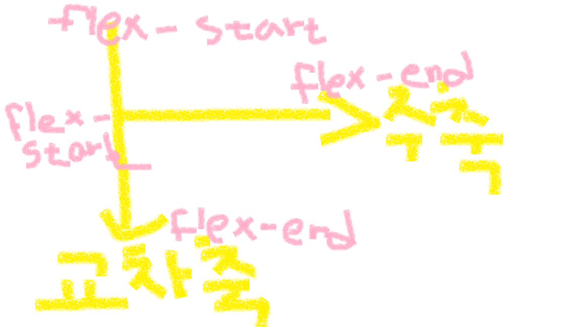
5. justify-content: 주축방향 아이템 정렬 지정
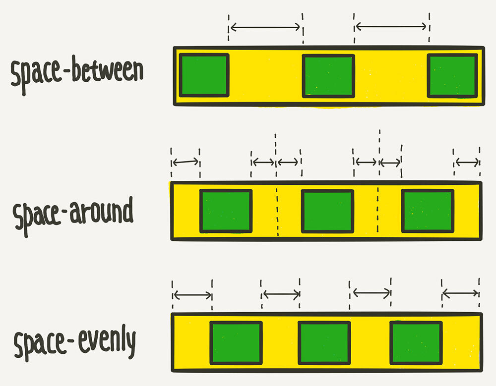
flex-start / flex-end / center / space-around / space-between
6. align-items: 교차축 아이템 정렬 지정 (한줄일 때)
flex-start / flex-end / center / stretch (default)
7. align-content: 교차축 아이템 정렬 지정 (여러줄일 때)
flex-start / flex-end / center / space-around / space-berween / stretch
space-between을 많이 쓸 예정 !
item에 주는 속성
1. order: 아이템 배치 순서를 지정
2. align-self
flex-start / flex-end / center / stretch / baseline
flex_layout.html (초안)
<!DOCTYPE html>
<html lang="en">
<head>
    <meta charset="UTF-8">
    <meta http-equiv="X-UA-Compatible" content="IE=edge">
    <meta name="viewport" content="width=device-width, initial-scale=1.0">
    <title>Document</title>
    <style>
        * { margin: 0; padding: 0; box-sizing: border-box; }
        #parent {
            width: 1000px;
            background: lightcyan;
            height: 500px;
            margin: 0 auto;
            display: flex; /* 부모한테 이거 주면 자식은 부모 높이만큼 가짐 */

            /* default */
            flex-direction: row;
            /* flex-wrap: nowrap; nowrap: 부모 width만큼 알아서 너비 줄어짐 */
            flex-wrap: wrap; /* wrap: 원래 자식 크기만큼 가짐 */
            /* default /*/
            justify-content: space-evenly;
            align-content: space-between;
        }
        .item {
            width: 300px;
            height: 100px;
            background: blueviolet;
        }
    </style>
</head>
<body>
    <!-- div#parent>div.item*5 -->
    <div id="parent">
        <div class="item">div1</div>
        <div class="item">div2</div>
        <div class="item">div3</div>
        <div class="item">div4</div>
        <div class="item">div5</div>
    </div>
</body>
</html>
flex_layout.html
<!DOCTYPE html>
<html lang="en">
<head>
    <meta charset="UTF-8">
    <meta http-equiv="X-UA-Compatible" content="IE=edge">
    <meta name="viewport" content="width=device-width, initial-scale=1.0">
    <title>Document</title>
    <style>
        * { margin: 0; padding: 0; box-sizing: border-box; }
        #parent {
            width: 1000px;
            background: lightcyan;
            height: 500px;
            margin: 0 auto;
            display: flex; /* 부모한테 이거 주면 자식은 부모 높이만큼 가짐 */

            /* default */
            flex-direction: row;
            /* flex-wrap: nowrap; nowrap: 부모 width만큼 알아서 너비 줄어짐 */
            flex-wrap: wrap; /* wrap: 원래 자식 크기만큼 가짐 */
            /* default /*/

            justify-content: space-evenly;
            align-items: flex-start;
        }
        .item {
            width: 300px;
            height: 100px;
            background: blueviolet;
        }
        .item:nth-child(3) {
            background: tomato;
            order: -1;
            align-self: flex-end;
        }
    </style>
</head>
<body>
    <!-- div#parent>div.item*5 -->
    <div id="parent">
        <div class="item">div1</div>
        <div class="item">div2</div>
        <div class="item">div3</div>
        <div class="item">div4</div>
        <div class="item">div5</div>
    </div>
</body>
</html>
flex로 display하기
flex_layout_ex.html
<!DOCTYPE html>
<html lang="en">
<head>
    <meta charset="UTF-8">
    <meta http-equiv="X-UA-Compatible" content="IE=edge">
    <meta name="viewport" content="width=device-width, initial-scale=1.0">
    <title>Document</title>
    <style>
        /* 초기셋팅 */
        * { margin: 0; padding: 0; box-sizing: border-box; }
        li { list-style: none; }
        a { text-decoration: none; color: inherit; }
        body { color: #333; }
        /* 초기셋팅 /*/

        #wrap {
            width: 100%;
            max-width: 1200px;
            margin: 0 auto;
        }
        #header {
            width: 100%;
            padding: 40px 0;
            display: flex;
        }
        #header h1 {
            width: 70%;
        }
        #header ul {
            display: flex;
            width: 30%;
            align-items: center;
        }
        #header li {
            width: 25%;
            text-align: center;
        }
        #content {
            text-align: center;
        }
        #content h2 {
            padding-bottom: 20px;
            border-bottom: 2px solid #333;
        }
        #content ul {
            padding: 30px 0;
            display: flex;
            justify-content: space-between;
        }
        #content li {
            width: 30%;
            border: 1px solid #333;
            padding: 30px 0;
        }
        #content span {
            font-size: 14px;
        }
        #notice h2 {
            text-align: center;
            padding-bottom: 20px;
            border-bottom: 2px solid #333;
        }
        #notice ul {
            padding: 20px 0;
            font-size: 14px;
        }
        #notice li {
            padding: 15px 0;
            border-bottom: 1px solid #333;
        }
        #footer {
            display: flex;
        }
        #footer p {
            width: 50%;
            font-size: 16px;
        }
        #footer h1 {
            width: 50%;
            text-align: right;
        }
    </style>
</head>
<body>
    <div id="wrap">
        <div id="header">
            <h1><a href="#">Green</a></h1>
            <ul>
                <li><a href="#">menu1</a></li>
                <li><a href="#">menu2</a></li>
                <li><a href="#">menu3</a></li>
                <li><a href="#">menu4</a></li>
            </ul>
        </div>
        <div id="main">
            <div id="content">
                <h2>메인컨텐츠01</h2>
                <ul>
                    <li>
                        <h3>작은제목 입니다.</h3>
                        <p>내용적는 부분입니다.</p>
                        <span>2020.12.17</span>
                    </li>
                    <li>
                        <h3>작은제목 입니다.</h3>
                        <p>내용적는 부분입니다.</p>
                        <span>2020.12.17</span>
                    </li>
                    <li>
                        <h3>작은제목 입니다.</h3>
                        <p>내용적는 부분입니다.</p>
                        <span>2020.12.17</span>
                    </li>
                </ul>
            </div>
            <div id="notice">
                <h2>공지사항</h2>
                <ul>
                    <li>2020 그린컴퓨터 아카데미 소식<span>2020.12.17</span></li>
                    <li>2020 그린컴퓨터 아카데미 소식<span>2020.12.17</span></li>
                    <li>2020 그린컴퓨터 아카데미 소식<span>2020.12.17</span></li>
                    <li>2020 그린컴퓨터 아카데미 소식<span>2020.12.17</span></li>
                </ul>
            </div>
        </div>
        <div id="footer">
            <p>주소: 서울특별시 용산구 한강대로 대표이사: 그린 사업자등록번호 : 110-12-12345 통신판매신고: 제 2020-서울용산-000호</p>
            <h1>Green</h1>
        </div>
    </div>
</body>
</html>
flex_layout_ex_teacher.html
<!DOCTYPE html>
<html lang="en">
<head>
    <meta charset="UTF-8">
    <meta http-equiv="X-UA-Compatible" content="IE=edge">
    <meta name="viewport" content="width=device-width, initial-scale=1.0">
    <title>Document</title>
    <style>
        /* 초기셋팅 */
        * { margin: 0; padding: 0; box-sizing: border-box; }
        li { list-style: none; }
        a { text-decoration: none; color: inherit; }
        /* 초기셋팅 /*/
        #wrap {
            width: 100%;
            max-width: 1100px;
            margin: 0 auto;
        }
        #header {
            display: flex;
            height: 100px;
            justify-content: space-between;
            align-items: center;
        }
        #header ul {
            display: flex;
        }
        #header li {
            padding: 0 20px;
        }
        #header li:not(:last-child) {
            border-right: 1px solid #ccc;
        }
        #main h2 {
            border-bottom: 1px solid #333;
            padding: 30px;
            margin-bottom: 30px;
            text-align: center;
        }
        #content ul {
            display: flex;
            justify-content: space-between;
        }
        #content li {
            width: 30%;
            text-align: center;
            padding: 30px;
            border: 1px solid #ccc;
        }
        #notice li {
            border-bottom: 1px solid #ccc;
            line-height: 40px;
        }
        #notice li span {
            float: right;
        }
        #footer {
            display: flex;
            justify-content: space-between;
            height: 80px;
            align-items: center;
        }
        #footer p {
            width: 70%;
        }
    </style>
</head>
<body>
    <div id="wrap">
        <div id="header">
            <h1><a href="#">Green</a></h1>
            <ul>
                <li><a href="#">menu1</a></li>
                <li><a href="#">menu2</a></li>
                <li><a href="#">menu3</a></li>
                <li><a href="#">menu4</a></li>
            </ul>
        </div>
        <div id="main">
            <div id="content">
                <h2>메인컨텐츠01</h2>
                <ul>
                    <li>
                        <h3>작은제목 입니다.</h3>
                        <p>내용적는 부분입니다.</p>
                        <span>2020.12.17</span>
                    </li>
                    <li>
                        <h3>작은제목 입니다.</h3>
                        <p>내용적는 부분입니다.</p>
                        <span>2020.12.17</span>
                    </li>
                    <li>
                        <h3>작은제목 입니다.</h3>
                        <p>내용적는 부분입니다.</p>
                        <span>2020.12.17</span>
                    </li>
                </ul>
            </div>
            <div id="notice">
                <h2>공지사항</h2>
                <ul>
                    <li>2020 그린컴퓨터 아카데미 소식<span>2020.12.17</span></li>
                    <li>2020 그린컴퓨터 아카데미 소식<span>2020.12.17</span></li>
                    <li>2020 그린컴퓨터 아카데미 소식<span>2020.12.17</span></li>
                    <li>2020 그린컴퓨터 아카데미 소식<span>2020.12.17</span></li>
                </ul>
            </div>
        </div>
        <div id="footer">
            <p>주소: 서울특별시 용산구 한강대로 대표이사: 그린 사업자등록번호 : 110-12-12345 통신판매신고: 제 2020-서울용산-000호</p>
            <h1>Green</h1>
        </div>
    </div>
</body>
</html>
flex_layout_ex_2.html
<!DOCTYPE html>
<html lang="en">
<head>
    <meta charset="UTF-8">
    <meta http-equiv="X-UA-Compatible" content="IE=edge">
    <meta name="viewport" content="width=device-width, initial-scale=1.0">
    <title>Document</title>
    <style>
        * { margin: 0; padding: 0; box-sizing: border-box; }
        body {
            background: #F1F1F1;
            color: #333;
        }
        #wrap {
            width: 100%;
            max-width: 1800px;
            margin: 0 auto;
        }
        li { list-style: none; }
        a { text-decoration: none; color: inherit; }

        #header {
            padding-top: 16px;
        }
        #top_title {
            width: 100%;
            height: 140px;
            background: #fff;
            text-align: center;
            padding-top: 35px;
        }
        #top_menu {
            width: 100%;
            height: 40px;
            background-color: #333;
            display: flex;
            align-items: center;
        }
        #top_menu ul {
            display: flex;
            color: #fff;
            width: 20%;
            padding-left: 40px;
        }
        #top_menu li {
            width: 33.333%;
        }
        #top_menu a {
            width: 80%;
            color: #fff;
            text-align: right;
            padding-right: 40px;
        }
        #content {
            display: flex;
            align-items: flex-start;
            padding-top: 16px;
        }
        #left_content {
            width: 77%;
            padding-right: 1%;
        }
        #right_content {
            width: 23%;
        }
        .white_box {
            background: #fff;
            padding: 16px;
            margin-bottom: 16px;
        }
        .graybg {
            background: #333;
            color: #fff;
            padding: 16px;
        }
        div.graybg {
            height: 100px;
            margin: 10px 0;
        }
        #footer {
            background-color: #ffe4b5;
            color: #4d4d4d;
            text-align: center;
            padding: 30px;
        }
        h2+ul {
            padding-top: 10px;
        }
    </style>
</head>
<body>
    <div id="wrap">
        <!-- 상단영역 -->
        <div id="header">
            <div id="top_title">
                <h1>My Website</h1>
                <p>Lorem ipsum dolor sit amet, consectetur adipiscing elit.</p>
            </div>
            <div id="top_menu">
                <ul>
                    <li><a href="#">link</a></li>
                    <li><a href="#">link</a></li>
                    <li><a href="#">link</a></li>
                </ul>
                <a href="#">link</a>
            </div>
        </div>
        <!-- 상단영역 //-->
        <!-- 본문영역 -->
        <div id="content">
            <div id="left_content">
                <!-- div.white_box*2 -->
                <div class="white_box">
                    <h2>TITLE HEADING</h2>
                    <p>Lorem ipsum dolor sit amet</p>
                    <div class="graybg">image</div>
                    <h3>Title text</h3>
                    <p>Lorem ipsum dolor sit amet, consectetur adipiscing elit.</p>
                </div>
            </div>
            <div id="right_content">
                <div class="white_box">
                    <h2>About Me</h2>
                    <div class="graybg">images</div>
                    <p>Some text about me in culpa qui officia deserunt mollit anim..</p>
                </div>
                <div class="white_box">
                    <h2>Popular Post</h2>
                    <ul>
                        <li class="graybg">image</li>
                        <li class="graybg">image</li>
                        <li class="graybg">image</li>
                    </ul>
                </div>
                <div class="white_box">
                    <h2>Follow Me</h2>
                    <p>Some text..</p>
                </div>
            </div>
        </div>
        <!-- 본문영역 //-->
        <!-- 하단영역 -->
        <div id="footer">Footer</div>
        <!-- 하단영역 //-->
    </div>
</body>
</html>
flex_layout_ex_2_teacher.html의 style.css
* { margin: 0; padding: 0; box-sizing: border-box; }
a { text-decoration: none; color: inherit; }
li { list-style: none; }
#wrap {
    background: #f1f1f1;
    padding: 16px;
}
#header {
    display: flex;
    flex-direction: column;
    justify-content: flex-end;
    height: 150px;
    background: #fff;
    text-align: center;
}
#top_menu {
    display: flex;
    justify-content: space-between;
    background: #333;
    color: #fff;
    line-height: 40px;
}
#top_title {
    height: 110px;
    display: flex;
    flex-direction: column;
    justify-content: center;
}
#top_menu ul {
    display: flex;
}
#top_menu a { padding: 0 20px; }
#content {
    display: flex;
    padding-top: 16px;
}
#left_content {
    width: 75%;
}
#right_content {
    width: 25%;
    padding-left: 16px;
}
.white_box {
    background: #fff;
    padding: 16px;
    margin-bottom: 16px;
}
.graybg {
    background: #555;
    color: #fff;
    padding: 16px;
}
div.graybg {
    height: 150px;
    /* margin-top: 16px;
    margin-bottom: 16px; */
    margin: 16px 0;
}
li.graybg:nth-child(1) {
    margin-top: 16px;
}
#footer {
    background: #666;
    text-align: center;
    padding: 20px;
}